Naming things and vertically centering things
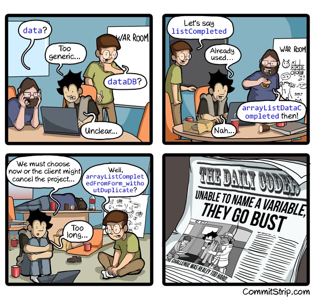
There are only two hard things in Computer Science: cache invalidation and naming things.> — Phil Karlton
Without any doubt, the tasks of vertically aligning UI components and creating a good CSS naming scheme are a challenge. In front-end development, there are some unique restrictions which make things even more difficult. In order to develop more reusable and widely supported UI components, the Peapod team has had to devise their own development practices and naming strategies. In this article, I detail the various approaches to controlling vertical alignment and their respective advantages and disadvantages. I then briefly discuss the Peapod development group’s approach to naming elements.
Vertically Center Things in 4 Ways
Centralize Peapod Logo and Brand Name
Absolute Positioning
Pros: Absolute positioning is supported by nearly all browsers. With absolute positioning, any element can be positioned at any location.
Cons: Absolute positioning is not adaptable at all. If you add new elements, you will most likely have to adjust the position of each existing element on the page. It can also be really hard to debug a layout issue if you have many UI elements to manage. Finally, this method is not recommended for use in any modern production websites.
Table Cell
Pros: Using CSS table layout is not a new concept. Back in the dark days, web developers used table to make really flexible layout without introducing semantically incorrect elements into the DOM.
Cons: Nesting tables can be very complex. Modern methods like Flexbox and CSS Grid make the code cleaner and easier to maintain.
Flexbox
Pros: Flexbox is extremely flexible, works in all modern browsers, and makes the creation of a responsive UI easy.
Cons: In each flexbox, you can only do a row or column style. If you have more complex layouts, you may end up with nested flexboxes.
CSS Grid
Pros: CSS Grid was created to overcome the issues related to flexbox. It results in a cleaner DOM structure even when used with very complex layouts.
Cons: CSS Grid is newer and not yet supported by all modern browsers.
Naming things in CSS
At Peapod, we’re using the Blocks, Elements, and Modifiers (BEM) CSS methodology to make our UI elements modular and reusable.
e.g A Sample DOM
<**div**` `class="message-box_container message-box--error"> <**div**` `class="message-box_icon-container"> <**span**` `class="message-box_icon message-box_icon--triangle"></**span**> </**div**>```` <**span**` `class="message-box_message"></**span**> </**div**>
We would use the following SASS snippet and compile into CSS.
.message-box` `{```` &_container {```` }```` &_icon {```` }```` &_icon--triangle {```` }```` &_message {```` }````}````.message-box--error {```` &.message-box` `{```` &_container {```` }```` }```` .message-box` `{```` &_icon {```` }```` &_icon--triangle {```` }```` &_message {```` }```` }````}
By using the above methodology we gain the structured aspect of object oriented CSS but we provide a semantic way to limit ourselves to the above restrictions. A nice side effect for this methodology is that it will be easier to recognize the priority of the styles and the depth of CSS selectors will be short most of the time.